
The Color That Called It First
Goldie Hawn was six years ahead of the interior design curve.
If you’ve watched Laugh-In or caught clips of her iconic 1980s homes, you know exactly what we’re talking about: that unmistakable butter yellow that radiated warmth, optimism, and unapologetic joy.
Fast forward to 2026, and suddenly, designers, home decor influencers, and wellness advocates are all preaching the same gospel Goldie lived: butter yellow isn’t just a color—it’s a mood.
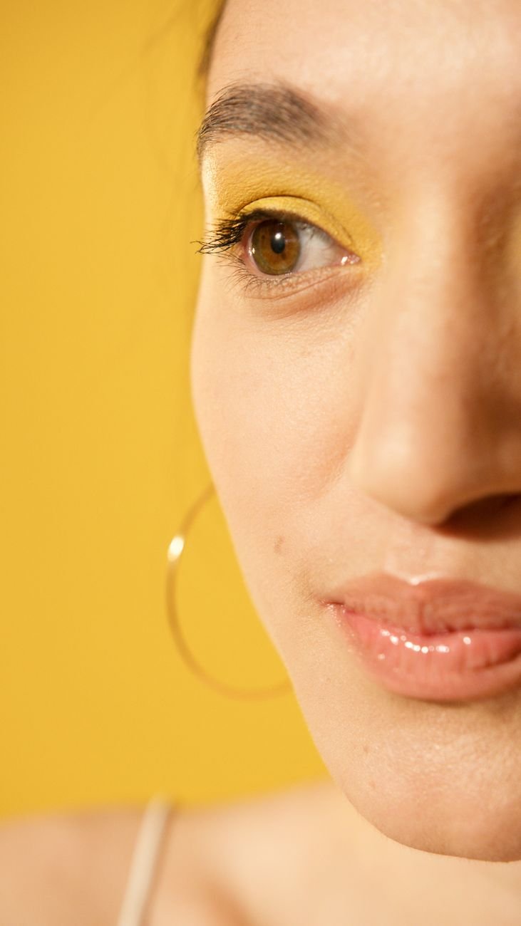
And here’s what makes this trend different from previous yellow moments: it’s not screaming canary or aggressively cheerful. Instead, it’s a soft, creamy, warm neutral that feels like you’re bathing a room in natural sunlight—without the harsh shadows.
Why Butter Yellow Now?
The wellness world has been connecting the dots between our environments and our mental health for years. Neuroscientists have long known that color psychology is real; warm, golden tones activate the brain’s reward centers and can actually reduce stress and anxiety. After years of cool grays and “calming” minimalism, homeowners are finally asking: Why settle for calm when you could feel genuinely happy?
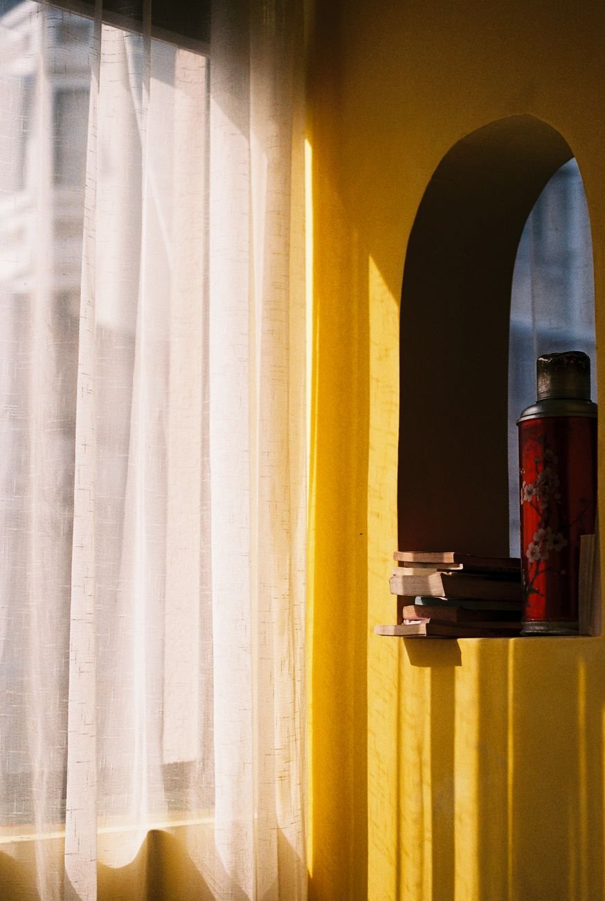
Butter yellow delivers what design insiders call “dopamine decor”—aesthetics that literally make you feel better. It’s energizing without being overstimulating, warm without feeling dated, and sophisticated enough to work in any interior style, from modern farmhouse to contemporary minimalism to cozy traditional.
Three Low-Commitment Ways to Bring Butter Yellow Home
Start with an Accent Wall (The Safe Bet)
Not ready to commit? Paint a single wall in your home office, reading nook, or bedroom. The beauty of butter yellow is that it doesn’t need to dominate to work. One accent wall becomes an instant focal point that lifts the entire room without requiring a full renovation. Pair it with warm whites, soft grays, or natural wood tones for maximum impact.
Bring It in Through Textiles (The Flexible Route)
Throw pillows, a luxe area rug, curtains, or even a vintage armchair in butter yellow give you all the mood-boosting benefits without permanent commitment. Swap them seasonally, move them between rooms, or replace them as trends shift. This approach is perfect for renters or anyone who likes to refresh their space frequently.
Statement Furniture & Fixtures (The Investment Play)
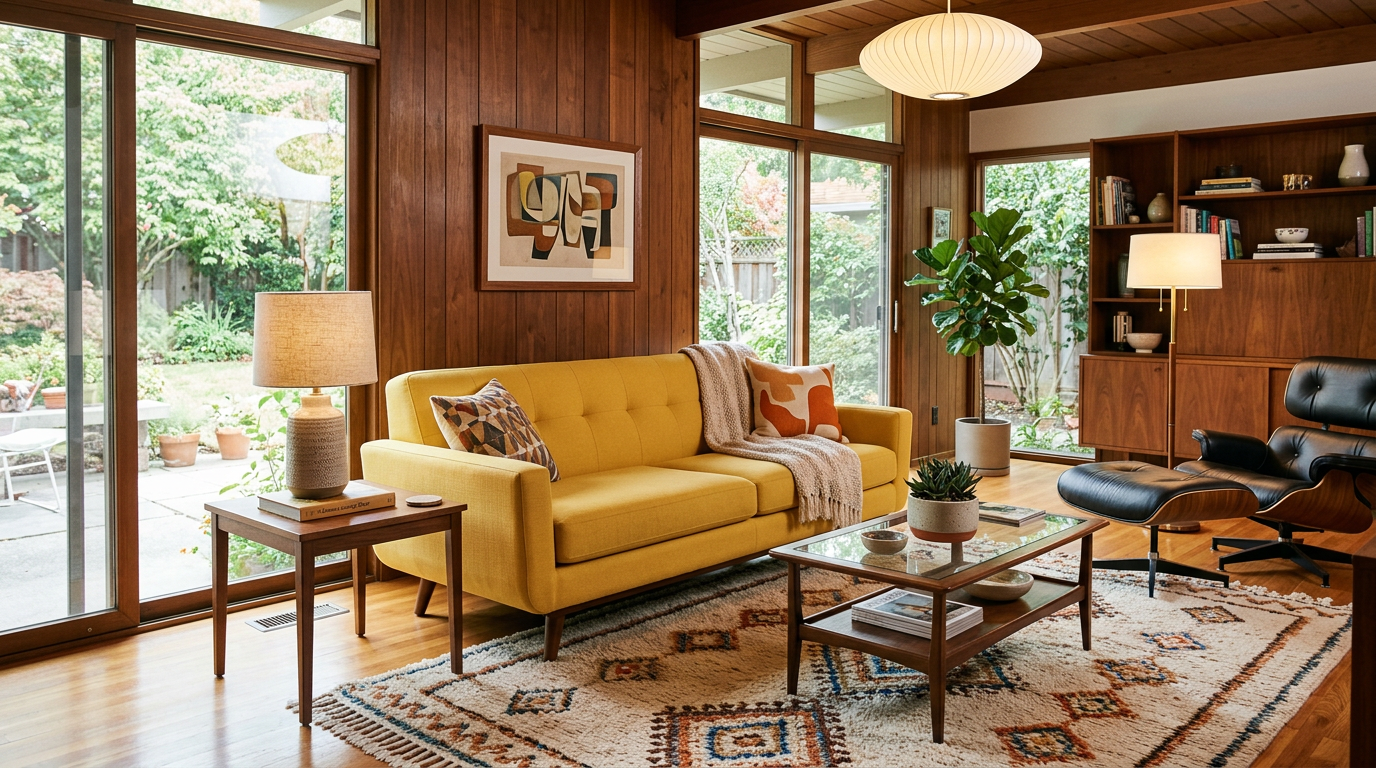
A butter yellow sofa, dining chairs, or vintage sideboard becomes the hero piece of your room. These moments feel intentional and designed, especially when paired with natural wood, brass accents, or warm metallics. It’s the approach that says: I know exactly what I’m doing.
The Styling Secrets Designers Won’t Tell You
- Lighting matters more than you think. Butter yellow looks best in spaces with natural light or warm-toned artificial lighting (think: warm white bulbs, not cool LED). The color actually glows in the right light.
- Pair it with texture, not just color. Linen, velvet, wool, and natural wood create depth and prevent the room from feeling flat or one-dimensional.
- Go warm or neutral with accents. Butter yellow plays beautifully with gold, brass, natural wood, cream, warm gray, and soft greens. Avoid cool silvers or harsh blacks if you want that cohesive, intentional feel.
The Dopamine Design Takeaway
The real trend here isn’t just butter yellow—it’s a return to spaces that make us feel something. After years of optimizing our homes for Instagram aesthetics, we’re finally prioritizing how our surroundings make us feel mentally and emotionally. Butter yellow is just the color leading that charge.
So yes, Goldie Hawn was absolutely onto something. And if you’re ready to borrow a little bit of that sunny optimism, there’s never been a better time.
Key Takeaways
- Dopamine decor is real: Butter yellow activates reward centers in the brain and reduces stress.
- Three low-commitment entry points: Accent walls, textiles, or statement furniture let you test the trend.
- Lighting and texture matter: Warm light and natural materials maximize butter yellow’s glow and prevent a flat look.
Leave a Reply